
2023
Shafa: creating a mental health app
Overview
National Wellness Institute is a global network of wellness professionals that provides courses, strategies and solutions for highly trained professionals seeking to improve their client's well-being and health.
Shafa is an app created to help people emotionally by connecting their therapist's recommendations of activities between sessions with their pacients.
About
Role
Creation of an wellness app
Product design, Product Strategy, User Research, Interaction, Visual design, Prototyping & Testing, Information Architecture
Team
4 product designers
The client
National Wellness Institute is a global network of highly trained professionals striving to active high-level wellness for everyone, everywhere, since 1977. They provide courses, strategies and solutions for certified professionals with the purpose of improvement of well-being and population health.
The proposition is to create a solution for one of the six segments of wellness based on research. The users must be able to create their profile, and the professional must be able to keep track of their client's evolution and stimulate the user to have a more healthy lifestyle. Below are the six segments of wellness.

Research
Secondary Research
We took the decision to focus on the emotional dimension of wellness because Brazil is the most anxious country in the world. During he COVID-19 pandemic, depression and anxiety increased by 25% (World Health Organization), and mental illness affects 800 million people worldwide.
-
18,6 million of Brazilians (9,3%) deal with anxiety
-
49% of Brazilians worry about mental health
-
The global market for health and wellness apps overall is estimated at US$1.6 billion in 2021
-
Estimates suggest that poor mental health costs the world economy US$2.5 trillion per year, and is estimated that it will increase to US$ 6 trillion by 2030
-
People with severe mental conditions live 10 to 20 years less than the average.
Sources:
https://www2.deloitte.com/us/en/insights/industry/technology/technology-media-and-telecom-predictions/2022/mental-health-app-market.html
Organização Pan-americana de Saúde
World Health Organization
Survey
Based on our survey with users from all over Brazil, we collected the following data:
-
93% of the users that answered the survey have already dealt with anxiety
-
48% go to therapy
-
65% exercise to improve their mental health
-
42% meditate
-
80% wish they had a more organized routine
Users Interview
We interviewed 8 users about how they deal with anxiety. All of them go to or used to go to therapy. Their main tools when dealing with anxiety are:
-
Exercise and yoga
-
Meditation
-
Briefing techniques
-
Reading books
-
Hear relaxing songs
-
Self-care moments
-
Writing a journal
Specialists Interview
Psychologists and well-being professionals told us about the same tools users said above.
Besides that, we wanted to know what are the main concerns users have:
-
Poor connection with family and friends
-
Lack of clear goals for their self development
-
Not having an organized routine
-
Not finding a sense in life
Goals
-
Facilitate the connection between therapist and patient.
-
Help patients to put into practice their therapist’s suggestions.
Persona & Problem Statement
Persona
We created a persona of the client, merging some user characteristics.
Emília is a data analyst who is constantly stressed and anxious. She goes to therapy but can't put into practice all recommendations.

User Journey
Emilia's day is marked by a few distinct highs and lows. The most challenging part of her day is undoubtedly her morning commute, where she often finds herself stuck in traffic and feeling increasingly stressed. Once she arrives at work, she faces a new set of frustrations as she grapples with challenging tasks and deadlines. However, Emilia is not without her moments of joy. One bright spot in her day is the opportunity to connect with her classmates over lunch, where she can enjoy a much-needed break from her work responsibilities. Additionally, Emilia cherishes the chance to catch up with friends over the phone, which provides her with a much-needed sense of connection and support.

The Problem Statement
Emília is an anxious person and has trouble sleeping. She needs to put into practice the therapeutic indications to reduce her anxiety and improve the quality of her sleep.
How might we help Emília put in practice her therapist recommendations to reduce anxiety and improve quality of sleep?
Ideation
Overall analysis
Most mental health apps focus on one particular problem to solve. Whether ir meditation, calming techniques, or journaling.
Based on our research, we discovered that people who used to suffer from anxiety and successfully treated it don't rely on only one technique. They combine a mix of tools every day to maintain mentally healthy.
Another key research found is that having a clear routine decreases anxiety.
Therapists make recommendations for their clients to put in practice some activities between sessions to improve their everyday life. It's different for each person and each session. Putting it all in practice sometimes is challenging.
The product vision
As a product, we want to connect therapists to their clients, helping them put into practice their recommendations.
-
The app consists of two personas: the therapist and the client.
-
The therapist sets the client's goals each session and can keep track of what items their patients are interacting with the most.
-
The patients have clear goals, all in one app, avoiding getting distracted by severalapps.
Feature priorization
During our brainstorming session, we generated many ideas for potential features to add to our app. However, given that we needed to create a minimum viable product (MVP), we recognized the need to prioritize these features in order to focus on the most critical elements. This approach enabled us to create a more cohesive and effective product that could meet the needs of our users while staying within the constraints of our development timeline and resources.
Our must-haves:
-
Therapist's recommendation activities
-
Content of mindfulness, meditation, breathing, and more
-
Mood tracker
-
Journal
-
To-do list

Site map and user flow

To begin the design process, we first took the crucial step of organizing all of our information into a clear and concise site map. It helped to identify potential pain points and areas where we could streamline the user experience

Given the time constraints we faced, with just a few days to develop a prototype and conduct user testing, we strategically decided to focus on creating the primary user flow. By honing in on the critical path users would follow through the app, we could ensure that we addressed the essential features and functionalities.
Wireframes & testing
Lo-fi wireframes
To efficiently organize the necessary screens and content for our app, we employed the use of low-fidelity wireframes. This approach allowed us to quickly iterate on different ideas and refine the user experience without getting bogged down in the details.

Mid-fi wireframes &
Concept testing
In order to refine the design of our app, we conducted concept testing with multiple users using mid-fidelity wireframes, which proved to be an indispensable step in the development process.
Based on feedback from these test users, we made strategic changes to the layout, including moving the mood tracker and therapist appointment features to a more intuitive location on the app, resulting in a more effective and user-friendly product.
Users and specialists alike responded positively to the app, expressing enthusiasm and indicating that it would be a valuable tool in their daily lives.


The visual
The brand
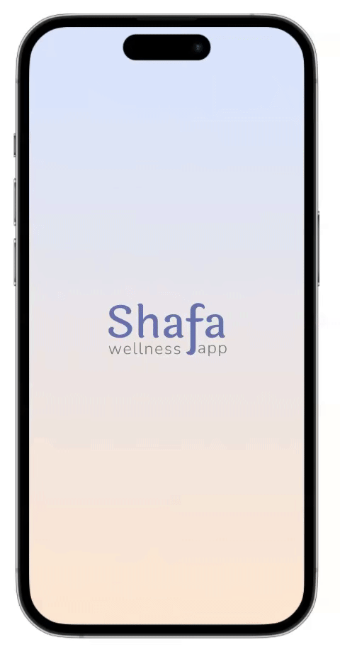
The name Shafa comes from the Arabic language word which means Cure.

The colors
In order to cultivate a calming and inviting atmosphere for our app, we deliberately chose to incorporate a mix of colours. Drawing inspiration from the soothing hues of a sunset, we created a gradient that transitions seamlessly from soft shades of blue to warm, gentle oranges. This colour scheme is intended to evoke a sense of peace and relaxation, providing a visual anchor for users to center themselves and engage with the app more mindfully. Additionally, we utilized illustrations to complement this aesthetic, choosing imagery that further reinforces the tranquil and stress-free theme of the app.

Style tile
-
The soft gradient is used on the background
-
CTA buttons are the same colour as the logotype
-
Special information is green
-
Texts are graphite

Prototype
Onboarding


High fidelity protoype
After defining all mid-fi wireframes, brand, style and style tile it's time to put it all together into the high fidelity prototype.
Feedbacks
We conducted usability testing with users, which provided the following results:
Positive things to keep:
-
Ease of use compared to other apps with a similar proposition
-
Pleasant, calming color palette
-
Concise and straight-to-the-point interface
Things to improve:
-
Repetitive and confusing writing
-
Very repetitive and tiring onboarding gradient
-
Some buttons with too much text
-
Mood tracker does not fit in the profile tab, it has to be on the first screen so that the person can update

Onboarding
The first steps of the user using the app show them the main features.
The first time of day that the user opens the app, it'll ask about mood to keep track of the evolution.
Doing the activities
The user picks the activity he will do, and the app shows a content catalogue. The user can choose by type and length.
In the end, the app gives feedback that this activity is completed.
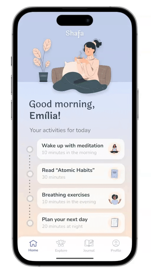

Main screens
The menu organizes the main content in:
-
Home: the activities list, mood tracker and therapist appointment.
-
Explore: relaxation content
-
Journal: diary and to-do list
-
Profile: Personal and the therapist information
If you feel like using the prototype yourself, click on the link below to check out the high-fidelity prototype:
Final thoughts
Monetizing the app
The app would be free for therapists of the National Wellness Institute club and paid for other therapists around the world.
Next steps
-
Launch the app MVP
-
Receive quantitative feedback
-
Add content of videos
-
Add offline moment
-
Prioritization tool
-
Dynamic interactions
-
Daily goals

Thanks for reading!