
2023
Indeed: Redesiging the biggest job search platform in the world
Overview
Indeed is the biggest job platform in the world. The positions are increasingly competitive, and being one of the first applicants is essential to get the chance of an interview or not.
That's why the app is so important: the users can apply as soon as possible from anywhere.
I improved the app to deliver a better user experience and help users keep track of the right positions easily and fast.
About
Role
Indeed App Redesign
Product design, Product Strategy, User Research, Interaction, Visual design, Prototyping & Testing, Information Architecture
Team
Daniela Teixeira
The client
Indeed is the biggest job platform in the worls. It connects open positions and job seekers in 60 countries and gets 500 million monthly visitors. It gets 10 job posts per second and has 175 million resume.

The number already is phenomenal, and in 2020 Indeed and Glassdoor partnered to help employers hire more efficiently.
Glassdoor is the worldwide leader in insights about jobs and companies. It gets 55 million monthly visitors and exists in 190 countries. Besides that, there are 1.9 million registered employees and 100 million company reviews.

+

Competitors
The main Indeed competitors today are
-
Linkedin: Linkedin is a networking platform that has been growing with job listings.
-
ZipRecruiter: Is another global job platform.
-
Google Jobs: Is a job search aggregator.

Purpose
Why did I redesign the app over the website?
According to Undercover Recruiter and 2022 Recruitment Marketing Benchmark Report,
67% of the job applications were done using mobile in 2021. And it has been increasing.
The biggest benefits users say about it is that it can be done from anywhere and that you can do it straight away. Unfortunately, the biggest challenge described that career sites are not optimized for mobile.
“The job market in my area is intensely competitive and fast-paced; you need to be one of the first 2-3 applicants in order to even be considered.”
Indeed user, 2023
Research
1. User reviews
In my quest to identify and address issues that cut across different regions and countries, I recognized the limitations of solely relying on interviews conducted within my local environment. As a result, I took a more expansive approach to gather insights for redesigning the Indeed app by analyzing user feedback on the App Store and Google Play.
Given that users rated the app on a scale of 1 to 5 stars (where Indeed currently has a rating of 4.8), the comments provided by users offered valuable insights into what they appreciated about the app and areas that needed improvement.
Given that there is no human collecting this information, users tend to express their opinions and experiences with the app in a very direct manner.
To gain a better understanding of user sentiment, I reviewed over 60 comments and identified several recurring themes. Some of the most common comments related to the app's user interface and design, the quality of job postings, the ease of use, and the responsiveness of the app.

User reviews
Problems
After gathering user comments and creating an affinity map, I was able to identify the most frequent and critical issues that emerged, which include:
-
Inaccurate filters
-
Need to search and filter repeatedly
-
Imprecise salary rate
-
Difficult to track notifications
-
Unreliable employers
*Bugs and coding issues:
this is a very frequent problem, but it wasn't in my design scope.
Examples with screenshots:

2. Indeed Style Guide
Upon examining Indeed's Style Guide, it became clear that the brand values and vision were not fully reflected in the app's interface. While the company's focus on diversity, flow, and optimism was evident in the Style Guide, the UI lacked the complexity and nuance required to convey this message effectively.
I created a mood board that showcases Indeed's intended brand values, as outlined in the Style Guide.


Inconsistence with the style guide

-
Lack of diversity in design
-
Insufficient use of colour accents
-
Shapes fail to convey motion or flow
3. Information Architecture
Indeed is not just about job posting! It may seem like it if you use the app, but there is plenty of hidden information inside the app. Indeed has job posting, companies reviews and career advice (with certifications)
Take a look at the screenshots below and see how tricky it is to find the career advice section.

Information Architecture problems
Based on the content that Indeed has to offer I realized it is not organized as it should.
Some of the problems I found were:
-
Content is not clear: there are hidden pages
-
The menu is not organized
-
No clear prioritization
Screenshots of the app

My findings
The UI is getting on the way of the job search.
The brand is already worldwide recognized. It’s important to keep it updated to maintain as the #1 top search platform in the world.
Ideation
Site map
The first step in organizing the redesign was to do a site map. It helped me to set the right place for each section and prioritize them.

Wireframes & Prototyping
Lo-fi wireframes
The first sketches of the redesign I did by hand to translate the idea into design.


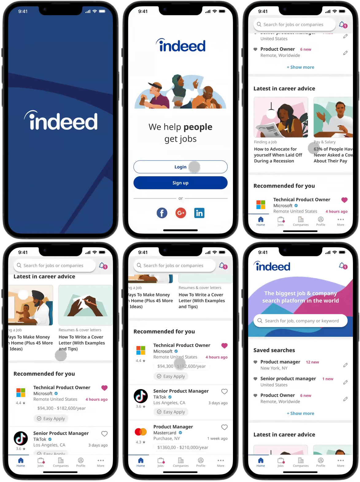
First screens
The moving opening of the app, brings the movement that is talk about on the style guide.
The Indeed app's home screen provides users with easy access to all the main subjects and features that the platform offers:
-
Search input
-
Saved searches (with filters)
-
Career advice
-
Jobs recommended for you
-
Companies you follow
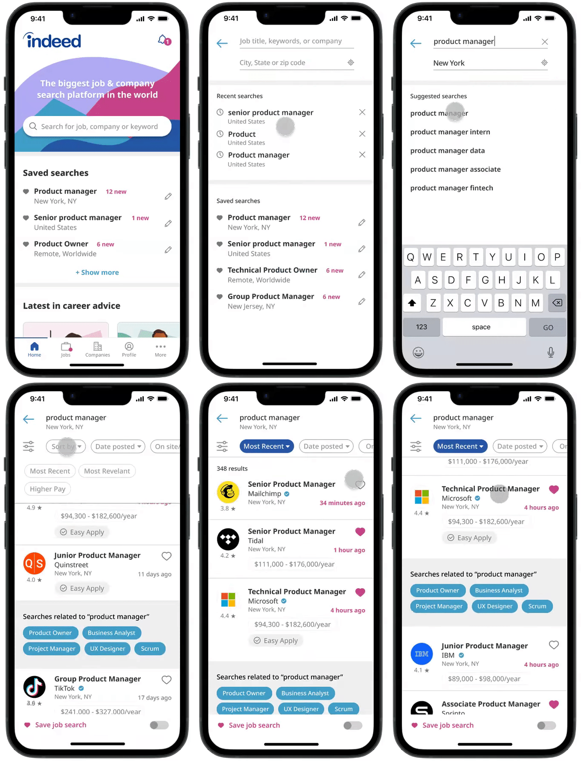
Searching for a job
When using the job search function, the app provides users with personalized recommendations and displays their recent search history for convenience.
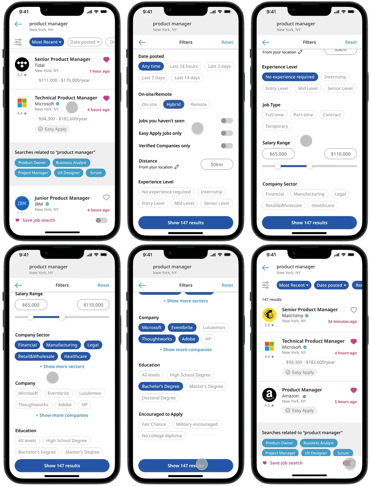
Filters
The app's filters are user-friendly and precise, and users can conveniently save their search criteria along with their selected filters.
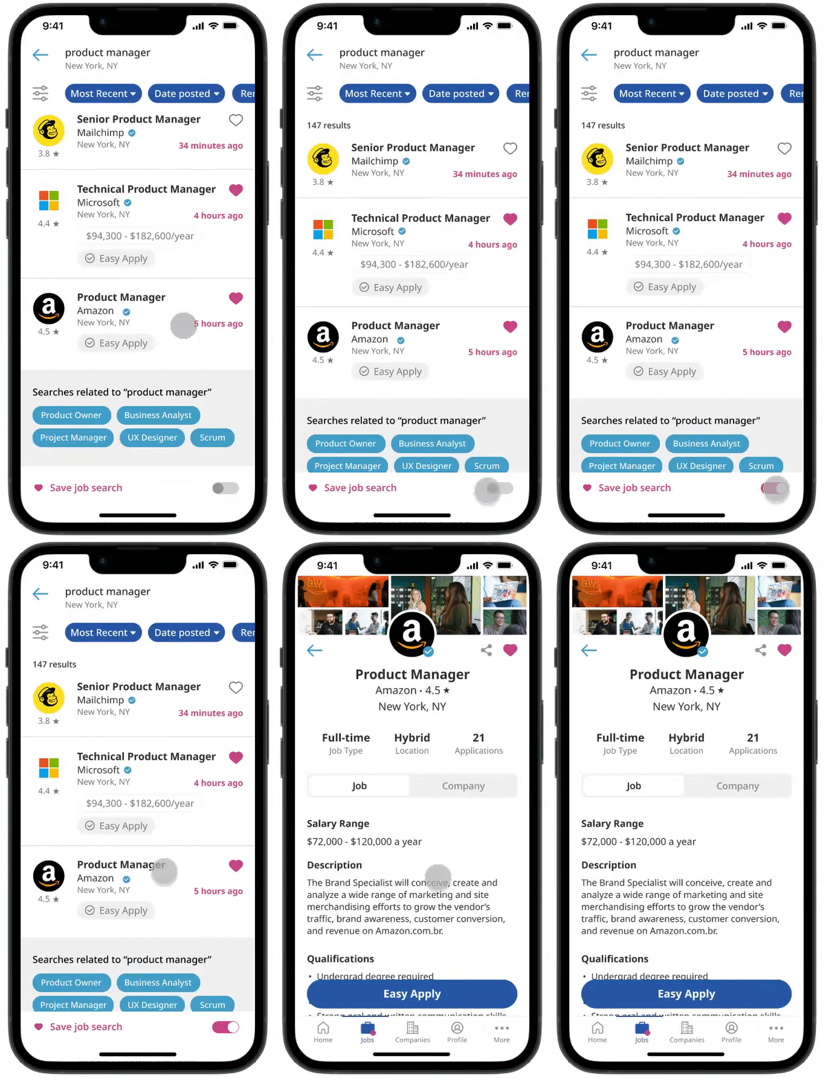
Job screen
The job screen was reorganized with logotype, background and company information.
To address the issue of untrustworthy employers, I implemented a verified stamp that connects to information on Glassdoor, which has been integrated into the reorganized job screen that now includes the company's logo, background, and other relevant details.
If you feel like using the prototype yourself, feel free to click on the button below

Before

Before

Redesign

Redesign
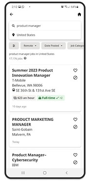
Before

Before

Redesign

Redesign


Next steps
-
Create all the pages of the app
-
Validate with more users
-
Dark mode
-
Incentivize employers to respond to applications & take off outdated job postings.

Thanks for reading!